Behind the scenes at Firespiral, Firespiral Wraps Database
Introducing a new design: guest review by May G-B!
We’ve been working on a new design, with a working title of ‘Northern Lights’, for many months now. It was a difficult process because, like the ‘Winter Hill’ design, it has personal significance and that makes every single pencil mark so much more important. Sentiment can stir up a special level creative energy and sensitivity, but if left unchecked it can become almost debilitating, so actually completing a design requires a careful balance between objectivity and intimate involvement.
We are going to tell you so much more about the inspiration behind the design and the journey of its creation, its significance to us etc, but as a starting point we thought we should let you hear from May, who reviewed our prototype for us without any background information from us.
The wrap that she tested was a 100% combed cotton, woven as a prototype in ecru and deep green, although these won’t be the colours of our first release. We also need to finalise the design name, although I think I know what it should be called as far as I’m concerned!
[pullquote align=center]
“I’ve been eagerly awaiting the new Northern Lights design since we first heard rumours of its development, so I was ridiculously excited when I heard I was going to review it. Then I got worried. The Aurora Borealis has special meaning to me; my husband & I were lucky enough to see it on the holiday he proposed. I realised that I’d imagined the new design in glorious detail, and had huge expectations. As I awaited the tester wraps arrival, I started thinking… How would it be possible to capture this magical, natural phenomenon on a two dimensional piece of fabric? I began to worry that I’d built myself up for a bit of a disappointment.
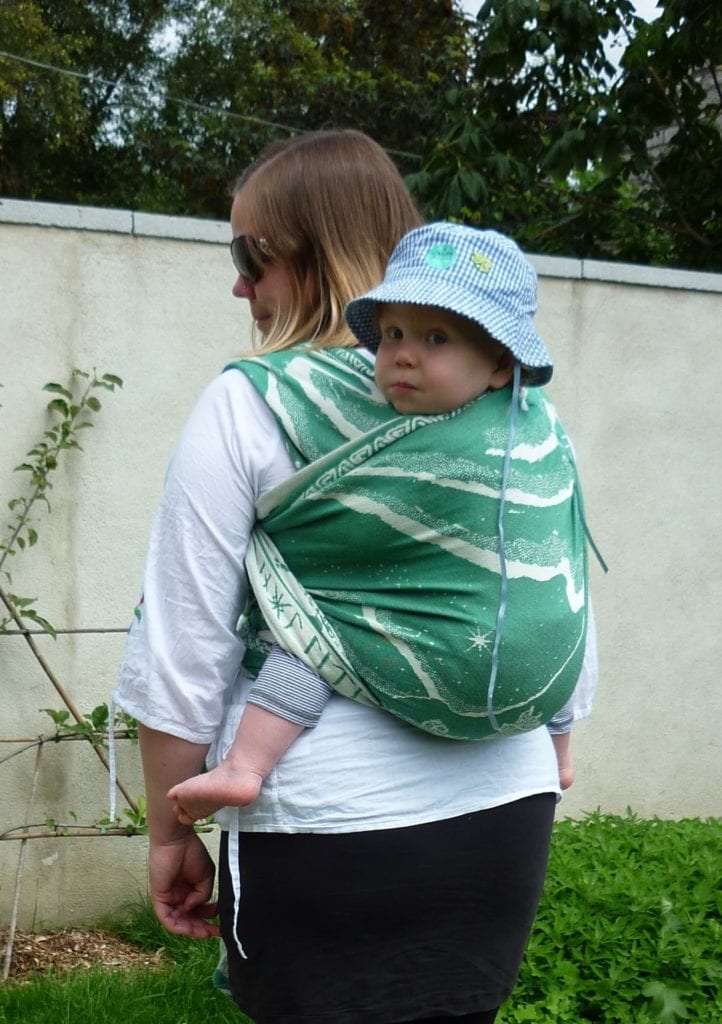
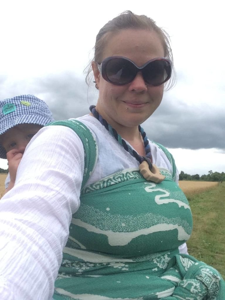
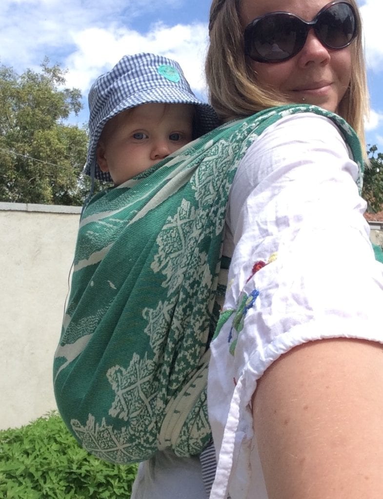
Well, I should have had more faith as those talented Firespiral ladies absolutely nailed it! Their delicate, organic design perfectly captures the movement of the aurora, with dancing swirls, and stars blinking over a hilly skyline. There’s even the occasional Firespiral comet. A beautifully stylised fir tree forest nestles below the aurora. The bottom rail is marked with runes reading, I think, “Fire Spiral” (sorry, my Elder Futhark is a little rusty!). They complement the aurora perfectly & bring a little more Norse magic to the feel of the design. A repeating triangular design runs along the top rail which may have a deeper meaning, but reminds me of the symbols for the elements earth, air, fire and water. Perhaps that’s because of how I see this wrap design. Beautiful, magical and perfectly capturing the marriage of nature and mythology.


Can you post a pic of the rail with the runic on? I might be able to read…
Aw it’s interesting to learn that this is how Charters Moss got its start!